Earlier this month we shared with you recent changes to our order management grids, a step forward in offering more control for our merchants’ teams. This week, we rolled out another round of helpful additions and upgrades to continue that process. These include:
- The addition of Order Attributes for capturing order-specific info during checkout
- Upgrade to our Manage Order Status screen in the admin for building your workflow
- Order Status color assignment
- Viewed order column makes it easier to see which orders have not been reviewed yet
- Ordered Items page can be added to customers’ My Account section to see a list of purchased items
There’s a lot here, so let’s review them in turn.
Order Attributes
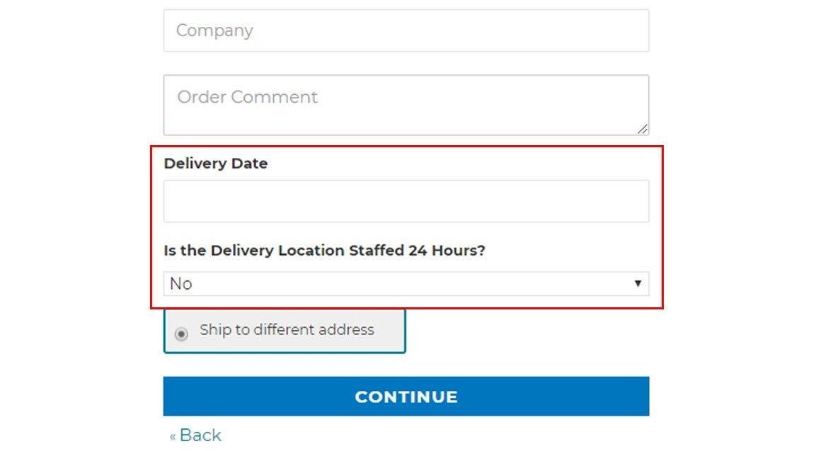
Order attributes is a feature long requested by our customers – a way to be able to add additional fields to checkout. There are a variety of pieces of information that may prove helpful during checkout:
- Special instructions
- Date to ship the order
- PDF documentation
- Order ID number
You can add any attribute of your choosing, and can decide for which customer groups the information is asked. If you have B2B-specific questions, for instance, you can hide them from your B2C customers.
Manage Order Status Upgrades
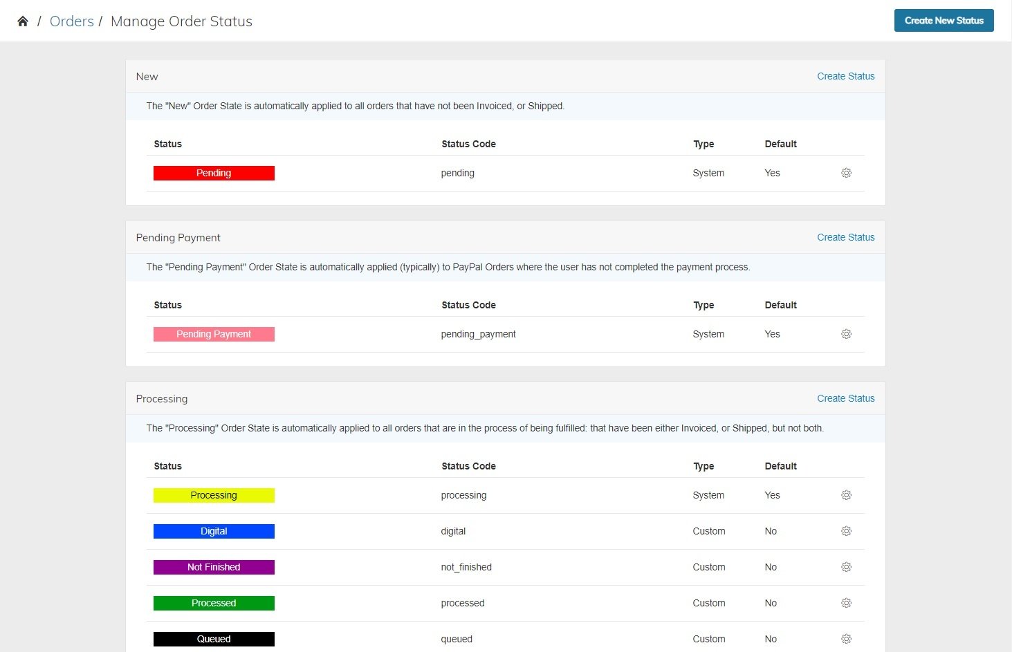
With the recent changes to the Order Grid, Order Status management has become a bit more important, since they can tie in with the recently added Order Grid tabs. The Manage Order Status screen lets you establish steps specific to your business, and has long helped Zoey merchants.
The new enhancements make it visually easier to see where new steps fall in your workflow. The steps are grouped by order states, which each have a particular purpose and focus. You can manage and create new status types within each state, which can be helpful for organizing orders based on how you process them.
Order Status color assignment
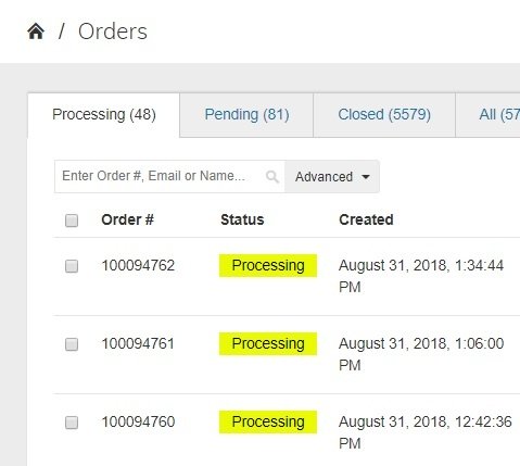
You’ll now find in the Order Grid these new status color bars implemented in the views to aid in visual review of your orders. You can manage those color assignments in the Manage Order Status screen, to establish a palette that works for you and your order processing rules.Along with the reorganization of the screen, we have added the ability to color code statuses, which are visually prominent and can help more easily allow a scanning of the product grid for orders in a certain status.
Viewed Orders column
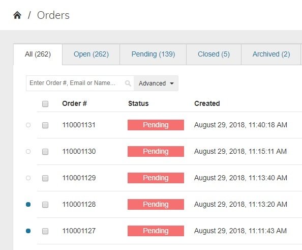
Another addition to the order grid to help working with orders that’s been established is the Viewed Orders column. Similar to the order status, it’s a new visual indicator that lets you see which orders have been viewed and which haven’t been seen yet.
The Viewed Orders column appears at the far left, before the checkboxes, when enabled in a grid. A filled dot indicates an unviewed order, so if you see an empty dot, it has already been filled. In case you forget which is which, you can hover your mouse over a dot and it will tell you which it is.
Ordered Items in My Account
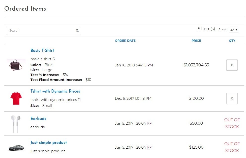
The final addition on this list isn’t an admin addition, but relates to order and your customers. A new feature that can optionally be enabled in My Account called “Ordered Items” can allow merchants to let customers peruse the items they most recently bought, presented in a view that allows for a quick addition of items to the cart.
For merchants who have items frequently reordered, or for customers who commonly buy the same things, this can be a quick way to build re-orders without having to visit each product page individually.
Zoey is constantly evolving
In a few days we’ll share other updates for August, but you can follow along by looking at our latest release notes in the Zoey support section:
We share all sorts of bug fixes and improvements that Zoey has made and released. With an average of 200 releases a year, Zoey is constantly bringing something new to its merchants.


