Zoey’s Visual Design Editor has long been one of our more unique offerings, combining the ease of use of a drag-and-drop editor with the power of being able to control your design without requiring code.
With our latest update, launched in February, we’ve added even more helpful capabilities that you may not be aware of. So in today’s post, we take a look at some of the secrets of Zoey’s Visual Design Editor, and how you can best leverage them for success.
This post will be part one of a series of articles on our updated Visual Design Editor, which in total will help provide tips and tricks on how to make the most of all the new additions.
Lock Elements Together
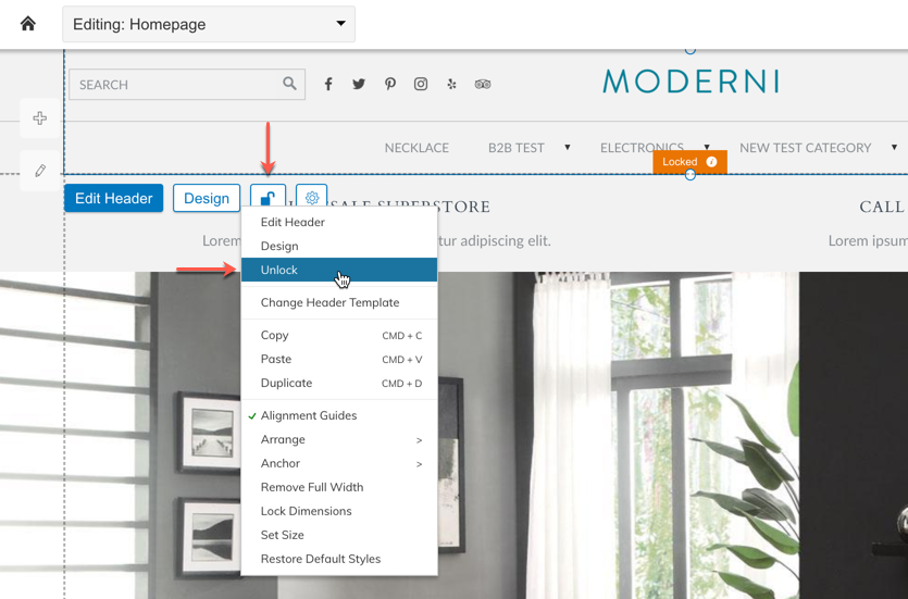
Locking and unlocking can be done either via the button added to the Visual Design Editor, or through the right click menu item.
When designing a page, you may have a few components that are designed to be utilized together. So, when you’re moving them around on the page, or checking the mobile view, the Lock capability can help with ensuring that the components are able to be kept together in a locked box.
The lock element effectively takes all of the components and locks them together for the purposes of the Visual Design Editor. When you try to move something inside a locked box, the entire locked object moves. When you place blocks side by side and lock them together, that layout is maintained when moving the locked box elsewhere. Using the lock feature doesn’t lock items in a specific spot on the page; they just lock the selected components to each other to create one larger box.
When elements are locked, the individual design elements can’t be manipulated, which reduces the risk of design breaks when simple edits are being made. The content is editable in one CMS panel, effectively treated as if the entire locked box is one block.
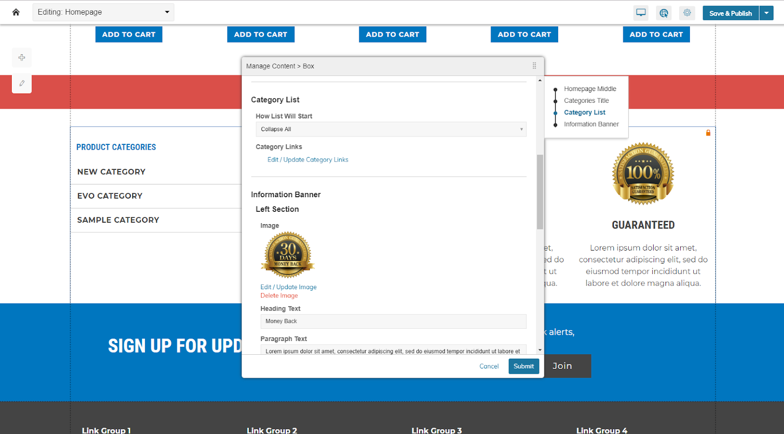
All of the content in a locked box can be edited at one time, even if they’re separate blocks locked together.
Our Santi theme has a locked set of elements near the bottom of the page. This can give you a simple way to take a look at how locked boxes work, and can be unlocked or locked together.
Learn more about how locked boxes work, and how to use them successfully, in our support knowledgebase.
Infinite Scroll Product Grid (Ajax Lazy Load)
It’s increasingly common for Ecommerce sites to eliminate more traditional category pagination, opting instead for an infinite scroll product grid, also known as Ajax Lazy Load. When a customer hits the bottom of the product grid, more products will automatically load, instead of a customer having to click a next or previous arrow to load an entirely new page.
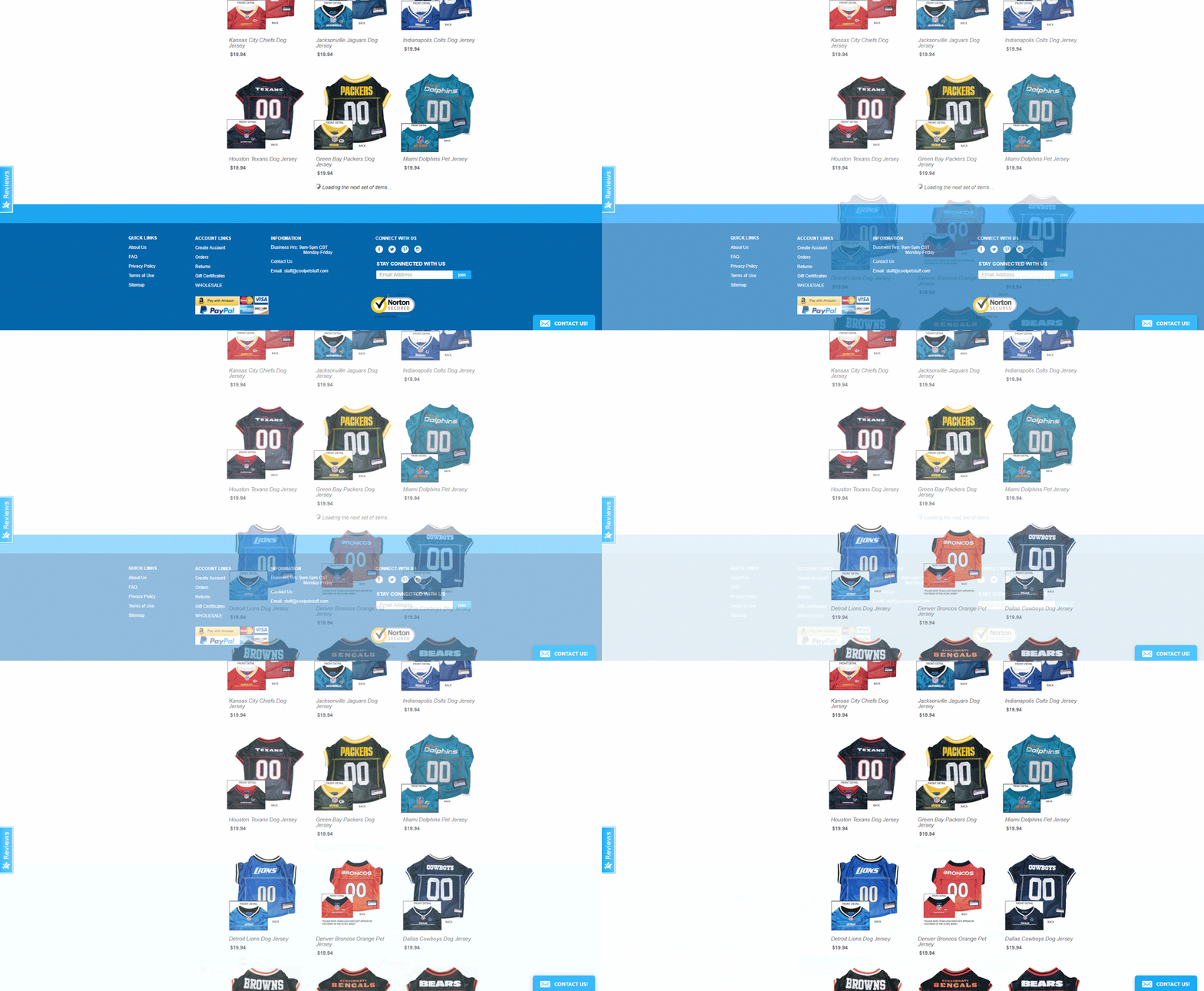
Infinite scroll automatically triggers another batch of products to load once a customer hits the end of the existing list.
You can decide how many products appear by default, and then a similar number will render upon the trigger of the lazy load. By loading less products upfront and allowing more to load as a customer scrolls, you improve page performance times with the initial load, while making it easier for customers to access the rest of your catalog. Using infinite products will have no impact on the search engine optimization of your site.
Infinite scroll can be enabled with just one click within the settings of the Category Products block. To learn how to implement the setting, click here to review the support documentation.
Sticky Header/Mega-Header
Another increasingly common element is the so-called Sticky Header, where the header locks to the top of the screen as you scroll down the page. Many site owners like sticky headers as it keeps menu options nearby for easier navigation on the store.
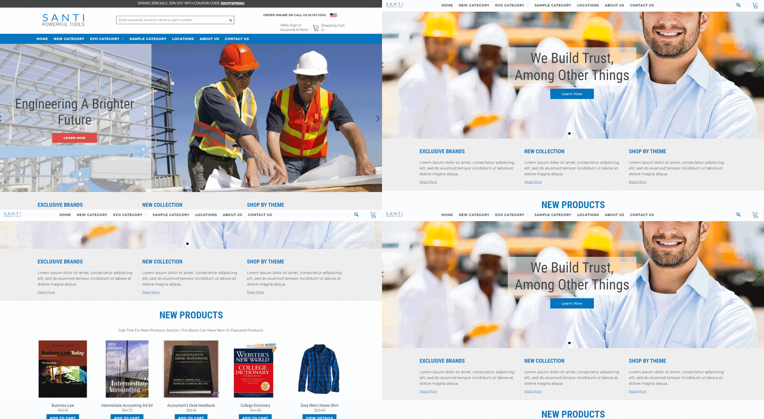
The sticky header locks to the top of the screen, keeping the navigation accessible no matter where a customer is on the page.
The sticky header is currently only available by default as part of the Santi theme, or if you wish to use the Santi header as part of a different theme, you can swap out your header to use it. For more information on how to implement the Santi header, which also includes Mega Menu and other capabilities, click here to read the tutorial.
More sticky header options will be available in time, but for now, the Santi theme is your best bet to making it happen.
Make Elements Full Width
The new Visual Design Editor can let you breakout of the page grid and have an element extend across the full width of the screen. You see heavy use of this in the new Santi theme, including the slideshows and promo banners.
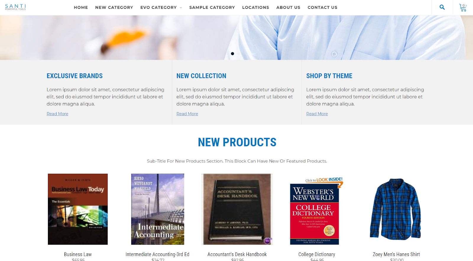
Certain blocks can now stretch from one edge of the screen to the other.
Only certain blocks have the ability to go full width, and it’s easy to check and set up blocks to use this feature. Simply right click on an object or the settings widget icon, and if you see a “Make Full Width” or “Remove Full Width” option, that block can be set to go full width.
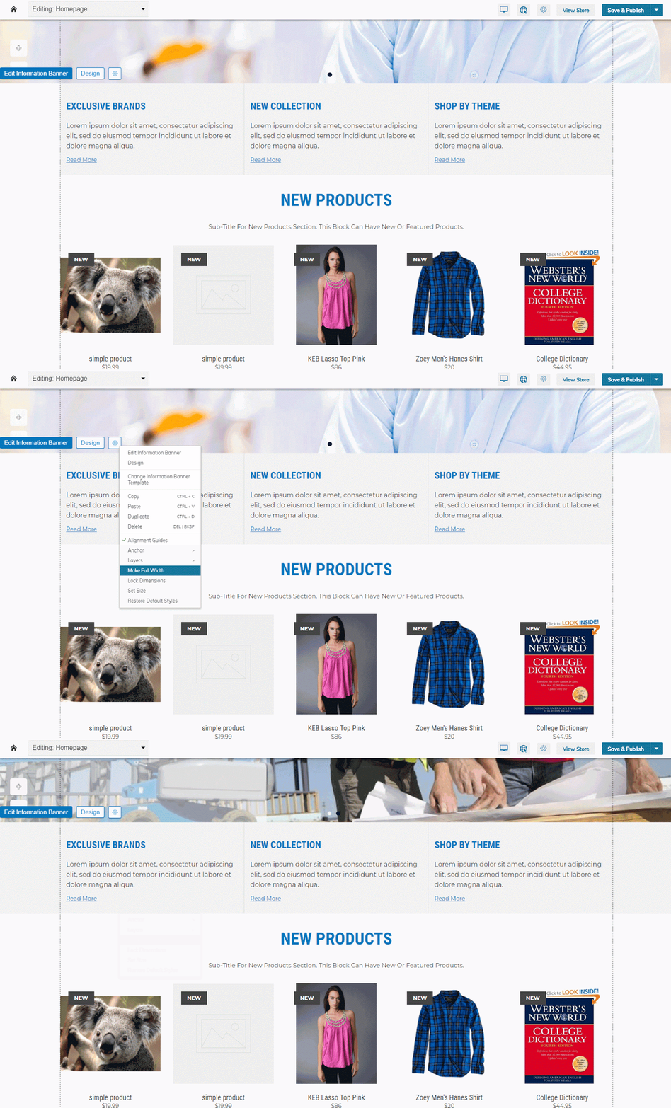
The “Make Full Width” settings will transform the block from fitting inside the page width to full screen.
Edit Slideshow Content on the Fly
The new Visual Design Editor comes with an enhanced management system for slideshows. You can add and edit slides on the fly and have it render in the editor. You can pause the slideshow and focus on a single slide for easy management. And we give you multiple slideshow templates to pick the best starting point for the content you wish to display.
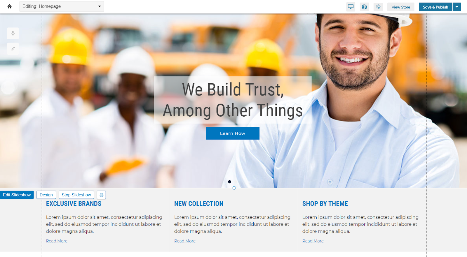
The “Stop Slideshow” button lets you focus in on the design of a slide.
You can stop the animation of the slideshow in the Visual Design Editor by clicking “Stop Slideshow.” You can then choose which slide you wish to edit by right clicking and using the Set Active Slide menu. Once you have set the active slide, “Design Active Slide” lets you set the design parameters for that particular slide. If you want different fonts, colors, or layout settings, this is how you make it happen.
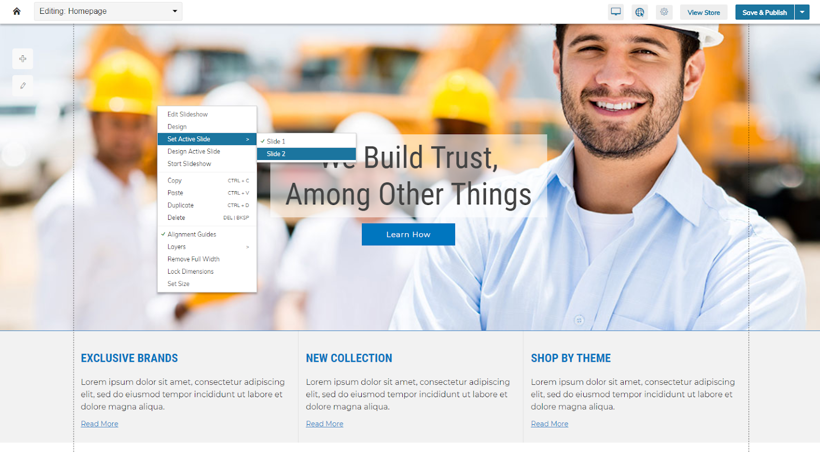
“Set Active Slide” lets you determine which slide you wish to design.
For editing content, it’s even more straightforward. Simply click the “Edit Slideshow” button and a list of your slides and slideshow settings will appear. Click “Edit” on the slide you wish to update, and a content edit screen will appear to update your image, text and button link.
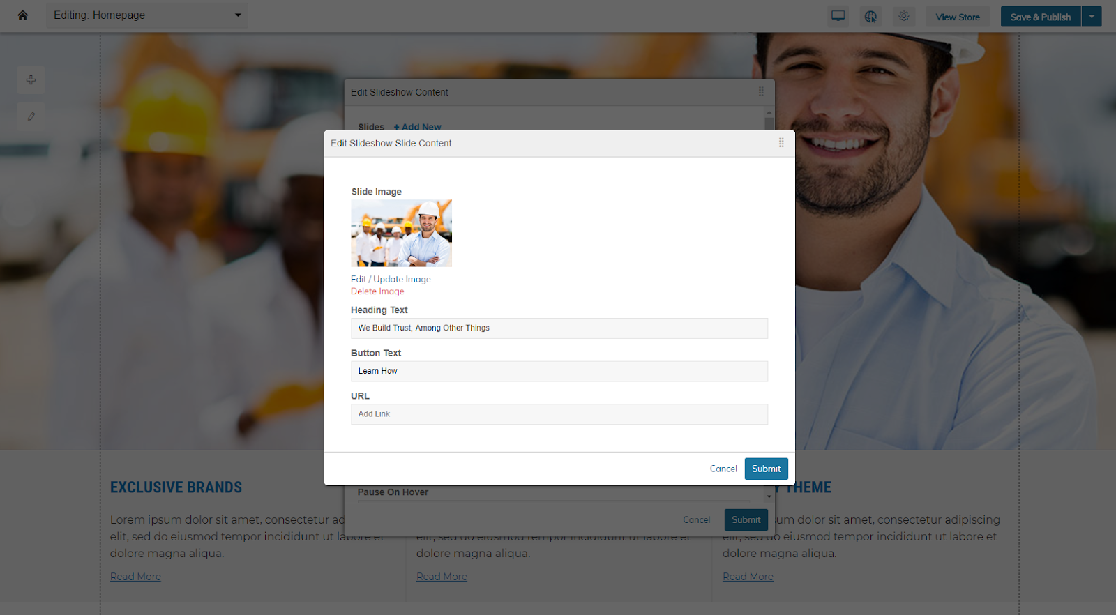
Like other areas of the Visual Design Editor, content and design are kept in separate locations, so editing content will not break the visual decisions made for your site’s design.
There’s a lot of other capabilities with slideshows, so it may be helpful to review our support documentation to see other possibilities as well.
Full Screen Content Editor
This is a small, but mighty, feature for those who work better with less distractions. The full screen content editor is a small button that lets you expand the CMS capability to fill your screen.
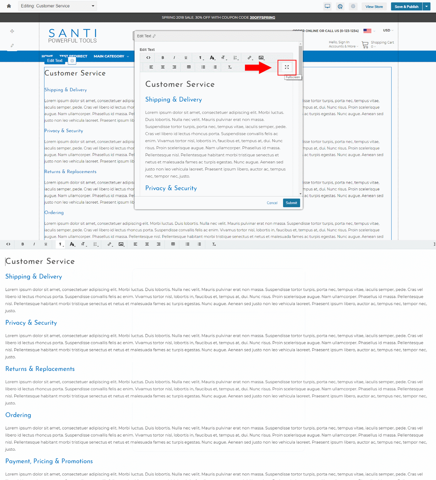
When you click the full screen button, the editor takes over and becomes the full focus, not unlike a document editor.
Full screen editing can be helpful for distraction-free content writing, and in some cases a more accurate representation of how the content will display in the page, before saving and updating the content in the Visual Design Editor.
More Secrets to Come
Coming up we’ll share more great secrets of the Visual Design Editor to help you make the most of its capabilities for your Zoey store.
Not using Zoey yet? We’d love to give you a walkthrough so you can learn about the Visual Design Editor and other key Zoey features. Simply click the button below to request a meeting:


