One of Zoey’s longstanding features has been its Visual Design Editor, which makes it easy to set up and maintain the design of your store without needing to code.
It’s evolved quite a bit over the last decade, and with the latest update we offer a new Header Navigation design option and Theme Branding tools to offer even more flexibility for your store.
Let’s explore the new capabilities and how you can take advantage of them today – it’s already live for all Zoey stores.
New Header Navigation
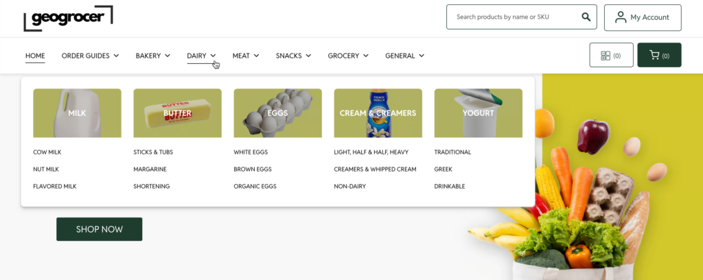
Our new Header Navigation can be added/swapped-in to any theme using a custom header.
Key features include:
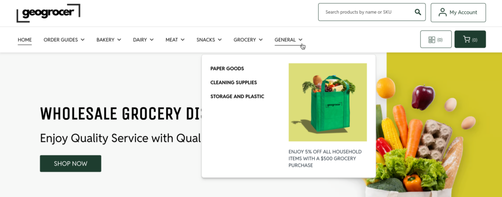
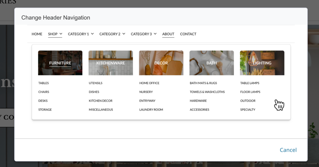
- Dynamic mega-menu will respond to your data to present different sub-menu layouts
- Sub-Category Thumbnail support
- HTML Promo Area for each parent-level category (uses the “Additional Category Information” field on the Category)
- Optimized for Tablet
- Greater ADA support including an optimized HTML structure with accessible screen-reader labels and better support for navigation via keyboard
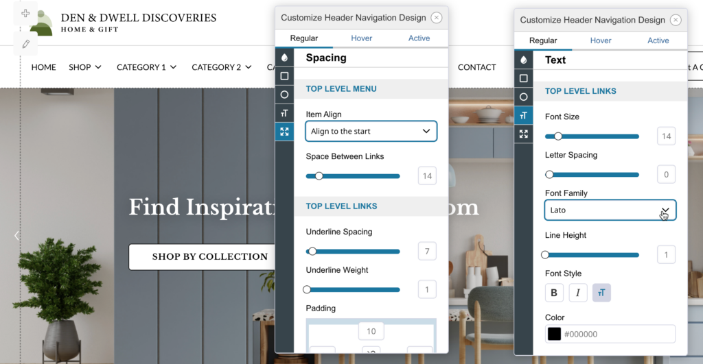
- More detailed design/branding support including font family selection, letter spacing, line heights, opacities and more!
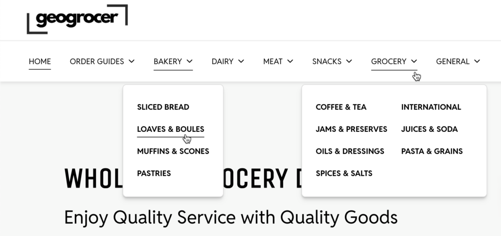
Want to see our new Header Navigation in action? We’ve set up a demo store where you can see all the new features implemented and live, just as it can appear on your store.
Get the New Header Navigation
It is easy to get stated with the new header navigation. Just follow these steps and you’ll have access to it on your store!
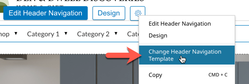
- In the Visual Design Editor, click the Gear icon on your header navigation component, then select “Change Header Navigation Template”
- Select the new header navigation template (see below)
Theme Branding
Theme branding has been updated to make styling your storefront both easier and more flexible than before.
Updates include:
- We’ve added a new color-picker that supports RGBA and HEX with Alpha values for transparency.
- Primary, Secondary and Alert color palettes have been automatically migrated into a series of new color schemes for your theme. New color schemes added include: Accent Color, Light Color, Neutral Color, Dark Color and Focus Color.
- Within each color scheme you can select a primary color as well as a “Color Contrast” value. We’ve also added a color contrast validator and the ability to automatically set the standard contrast value to match your baseline colors.
- These new color schemes and contrast values are used by default in our new Header Navigation component and will be used in all upcoming releases of new components that can be added to any theme.
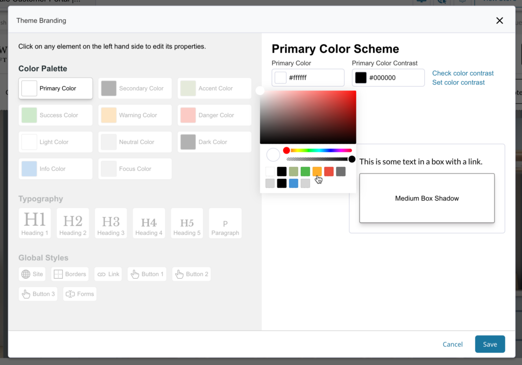
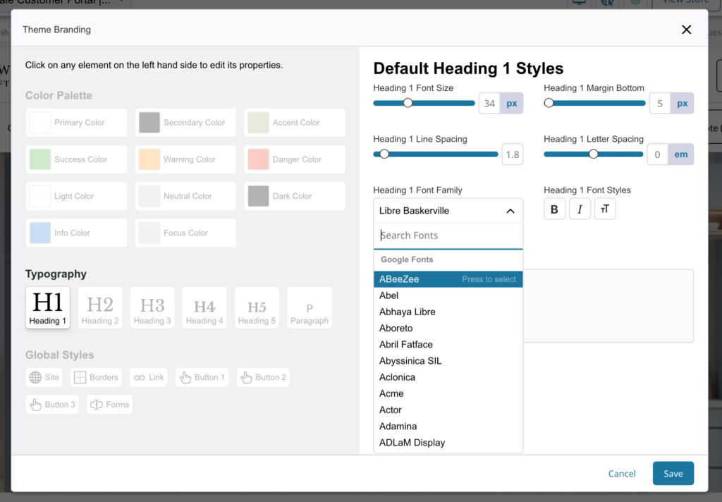
Typography has also gotten an upgrade and now supports 100% of available Google Fonts. Letter spacing can be set in “em” and we still support custom fonts uploaded in your theme asset manager.
Global Styles has been expanded to include full control over Button 3 as well as global settings for border radius, box shadow, icon font and more.
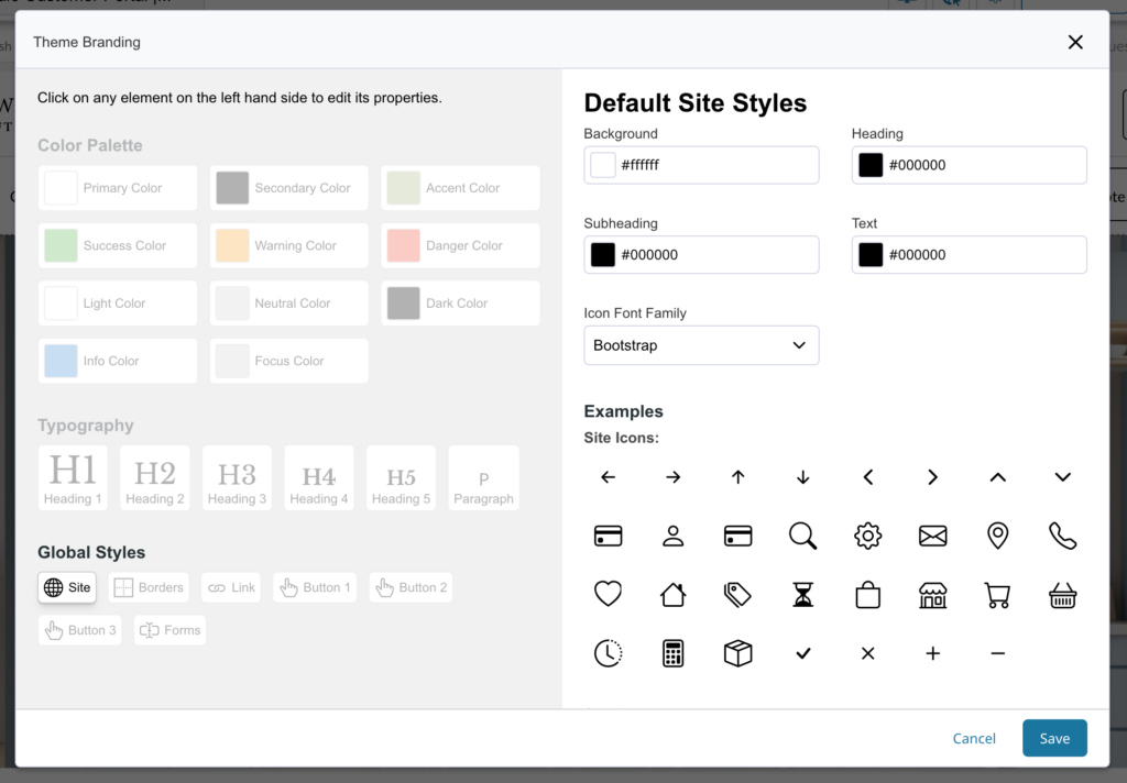
These Theme Branding updates lay a new foundation for Zoey as we continue to improve and release new components for the Visual Design Editor.
10 Years of Ecommerce Excellence, Available to You Now
Zoey’s been focused on B2B Ecommerce for a long time. Those insights and development mean you’re getting a mature, yet still evolving and improving platform that can raise your game against your competitors. Don’t wait any longer – contact us and we’ll show you how Zoey can transform your business:
