As mobile Internet traffic continues to outpace desktop usage, more and more Ecommerce sites are paying closer attention to the mobile experience of their site to ensure that customers can shop as easily from their phone as they can their computer.
Zoey’s Visual Design Editor has always provided a level of design control specifically around the mobile Ecommerce experience. But this week additional updates were made available to offer more specific control to further enhance and improve the mobile shopping flow.
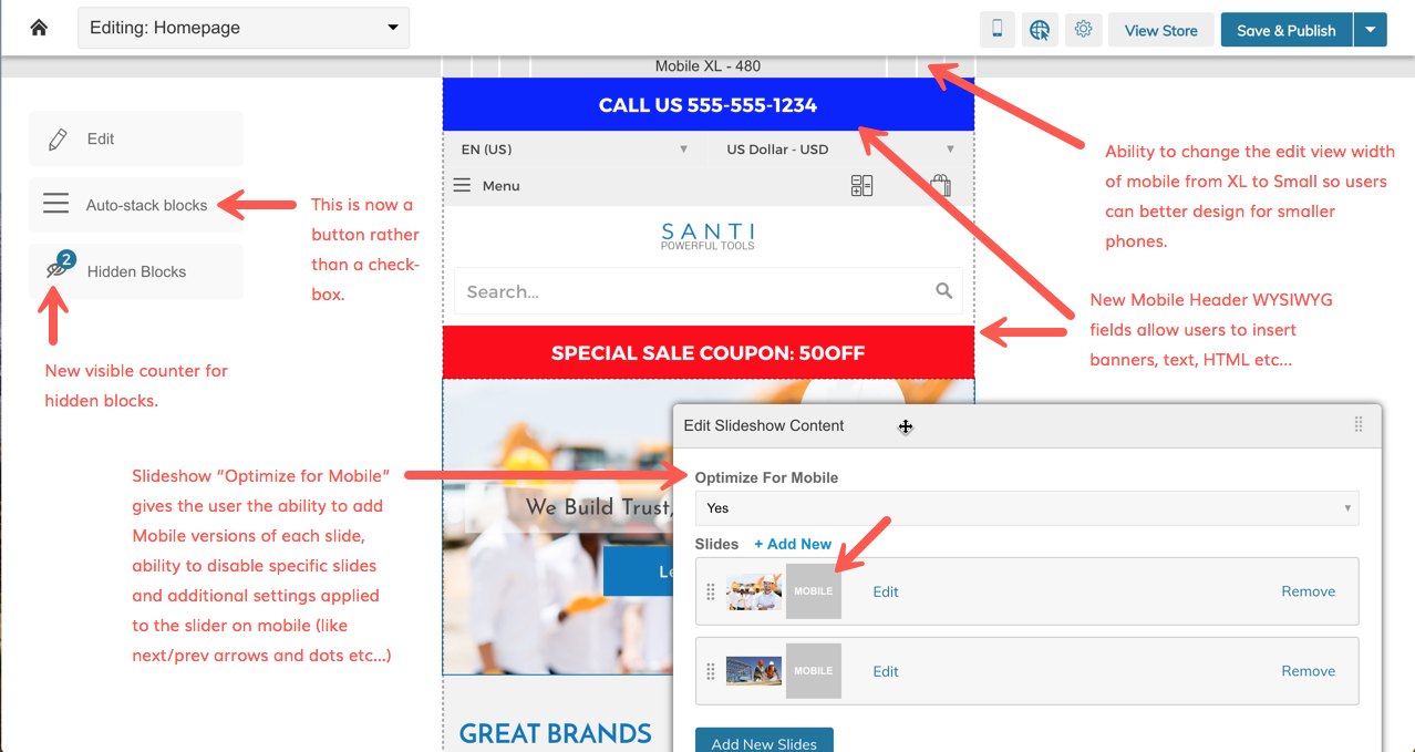
Among the changes launched include:
1. Editable sections specifically for mobile
Similar to editable areas we’ve been adding in recent weeks to checkout and PDFs, there are now editable areas in the mobile version of your theme to be able to add in text, HTML snippets, banners and more.
2. View at multiple widths
Mobile devices are more diverse than ever before, with screen sizes and resolutions that make it hard to do one mobile review and feel confident it works for everyone. We have established XL and small versions of mobile to allow our merchants to see how a site will look on a smaller width screen vs. a larger one.
3. Slideshow optimization
You can now set mobile-specific slides, disable specific slides and adjust how the content is displayed. Many times slideshows need adjustments to render properly in mobile, and this capability assists with those adjustments.
4. Hidden blocks better represented
A counter now helps merchants identify how many blocks are not shown in the mobile view. Zoey’s design editor has long had the ability to hide blocks from mobile view to simplify and streamline the flow, but it was not always obvious how many blocks were hidden from view.
Mobile Improvements with Zoey
Zoey’s mobile updates are just the latest example of our constant investment and evolution in making Zoey a strong choice for merchants. Click the button below to request a demo and learn what Zoey is capable of doing for your business:


